NotebookLM Slide Decks: Vom Prompt zur Präsentation in einem reproduzierbaren Workflow
NotebookLM Slide Decks werden reproduzierbar, wenn Persona, STYLE-Block und Design-Block als drei klar getrennte Schichten zusammenwirken. Der Leitfaden zeigt…
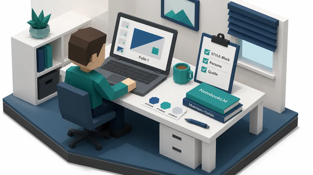
Wer schon einmal versucht hat, mit NotebookLM eine Präsentation zu bauen, kennt den typischen Reaktionsverlauf: erst Euphorie, dann ein Deck, das zwar schnell fertig ist, sich aber anfühlt wie hundert andere. Quellen sind hochgeladen, ein Prompt geschrieben, nach 90 Sekunden liegt ein Stapel strukturierter Folien bereit. Jede Aussage lässt sich zu einem Dokument zurückverfolgen. Soweit funktioniert das System erstaunlich reibungslos. Was dann folgt, ist meist der zweite Blick: Die Folien sehen generisch aus, die Typografie driftet, einzelne Charts wirken überladen. NotebookLM Slide Decks können mehr als das, was die meisten Nutzerinnen und Nutzer aus ihnen herausholen. Der Unterschied liegt nicht im Tool, sondern in der Prompt-Architektur.
Die zentrale Frage lautet daher: Wie lässt sich aus einem KI-Feature, das in 90 Sekunden einen ersten Entwurf liefert, ein verlässliches Präsentationssystem machen, das konsistent aussieht, Markenidentität transportiert und je nach Situation das passende Format bedient?
Antwort: indem man versteht, dass der Prompt nicht das Produkt ist, sondern eine Komponente in einem Workflow aus Recherche, Struktur, Design und Politur. Wer diesen Workflow einmal sauber aufsetzt, kann denselben Inhalt in zehn verschiedenen visuellen Stimmungen rendern, ohne jedes Mal von vorne zu beginnen.
Voraussetzungen: Was vorhanden sein muss, bevor der erste Prompt läuft
Bevor die ersten Folien entstehen, sind fünf Voraussetzungen zu klären. Sie entscheiden darüber, ob das Ergebnis reproduzierbar wird oder bei jedem neuen Notebook wieder bei null anfängt.
1. Ein gefülltes Notebook mit belastbaren Quellen. Mindestens drei, besser fünf bis zehn Dokumente, die das Thema tatsächlich tragen. PDFs, Google-Docs, Webseiten oder Notizen reichen, solange sie inhaltlich fokussiert sind. Ein einziges Notizbuch kann je nach Quellenauswahl sehr unterschiedliche Decks produzieren. Zu viele thematisch ferne Quellen sind der häufigste Grund, warum ein Deck inhaltlich driftet.
2. Klarheit über Format und Länge. NotebookLM kennt zwei grundsätzliche Ausgabeformen: Detailed Deck (umfangreich, textreich, liest sich eigenständig, eignet sich zum Versenden) und Presenter Slides (visuell, textarm, gesprochen). Hinzu kommt eine Längensteuerung über Short, Default, Long sowie die Möglichkeit, eine exakte Folienzahl im Prompt zu benennen. Wer diese beiden Hebel nicht bewusst setzt, überlässt dem Modell die wichtigste Gestaltungsentscheidung.
3. Eine Persona auf Notebook-Ebene. Über das Zahnrad-Symbol (Configure notebook) lässt sich eine Persona hinterlegen, die alle Studio-Ausgaben beeinflusst. Sie wirkt nicht in jedem Fall, erhöht aber die Wahrscheinlichkeit, dass Designprinzipien in den Output einfließen. Eine präzise formulierte Persona ist daher der erste Stellhebel für konsistente Qualität.
4. Ein STYLE-Block mit Markenwerten. Hex-Codes, Schriftarten, Tonalität, Bildsprache, alles, was die Markenidentität ausmacht, einmal in einem wiederverwendbaren Block festgehalten. Dieser Block wird vor jedem Generieren unter den Prompt kopiert. Wer seine Markenwerte im Brand-Guide als Quelle ins Notizbuch hängt und im Prompt auf sie verweist, entlastet den STYLE-Block zusätzlich.
5. Ein realistisches Bild von den Grenzen. Slides werden als Bilder gerendert, lassen sich also nicht wie in PowerPoint per Mausklick editieren. Wer das verstanden hat, gibt Design-Direktiven in den Prompt und nimmt Nachbearbeitung im PPTX-Export in Kauf. Seit Februar 2026 unterstützt NotebookLM den Export in PPTX (editierbarer Text, Titel, Speaker Notes) neben PDF (siehe Google Workspace Updates, Februar 2026). Das verändert den Workflow grundlegend: präzise Anpassungen und finales Brand-Styling passieren in PowerPoint oder Google Slides, nicht im Notebook selbst.
Schritt 1: Persona und STYLE-Block einmalig aufsetzen
Die Persona wird im Notizbuch selbst hinterlegt, der STYLE-Block lebt als kopierbarer Text. Beide werden zu Beginn einmal sauber formuliert und danach in jeder Sitzung wiederverwendet. Sie sind das Fundament, auf dem alle weiteren Schritte aufbauen.
Eine Persona, die Präsentationsdesign auf hohem Niveau verankert, kann so aussehen:
You are a Slide Deck Architect trained on the presentation masters.
Apply these on every deck:
- Duarte: build a "what is / what could be" arc with rising tension;
every slide passes a 3-second glance test
- Reynolds: one idea per slide, maximum whitespace, image + a few
reinforcing words, ruthless signal-to-noise
- Tufte: maximize data-ink, zero chartjunk (no 3D, shadows, heavy
gridlines); show every number "compared to what"
- Knaflic: the chart's title states its takeaway; annotate the one
proof number directly on the chart
- Atkinson: slide titles are full assertions, never one-word labels
- Williams (CRAP): contrast, repetition, alignment, proximity on
every layout
Ground every claim in the uploaded sources, never invent a statistic,
quote, or fact. When unsure, leave a labeled placeholder rather than
guess.
Dieser Persona-Text bündelt sechs Designprinzipien, die in der Präsentationsliteratur als Referenz gelten: Nancy Duarte (Situation-Complication-Resolution-Bogen, 3-Sekunden-Regel), Garr Reynolds (eine Idee pro Folie, maximale Leere), Edward Tufte (Daten-Tinte-Verhältnis, „compared to what”), Cole Nussbaumer Knaflic (Titel als Aussage, Preattentive Cues), Cliff Atkinson (Aussage-Titel statt Label) und Robin Williams (C.R.A.P.: Contrast, Repetition, Alignment, Proximity). Wer die Namen nicht im Detail kennt, muss sich die Prinzipien nicht einzeln aneignen: Die Persona trägt sie bereits in sich.
Der STYLE-Block ergänzt die Persona um die optische Identität. Hier landen konkrete Hex-Werte, Schriftnamen, Bildsprache, Abstände:
DESIGN SPEC (apply to every slide; keep identical across the deck):
- Aesthetic: [one phrase, e.g., "clean editorial, confident, lots of
whitespace"]
- Background: [exact hex]
- Primary font: [named font]; Accent font: [named font]
- Accent color: [exact hex], used only for emphasis and one key
number per slide
- Layout: generous margins, one idea per slide, left-aligned action-
statement headlines
- Iconography: simple line icons only; no clip art, no stock-photo
people
- Footer: small [brand] mark, bottom-right, every slide
Hold this palette and type EXACTLY consistent on all slides, do not
vary the accent hex.An dieser Stelle zahlt es sich aus, den STYLE-Block nicht als Vorschlag, sondern als verbindliche Direktive zu formulieren. „Modern, freundlich” wird vom Modell ignoriert. „Primary #0A2540, Accent #00C2A8, Inter für Headlines, Source Sans 3 für Body, 1.6 Zeilenhöhe, 24px Folienrand” wird übernommen. Wer seinen Marken-Guide als Quelle ins Notizbuch lädt und den Prompt um die Zeile „Use the attached brand guide for all colors, fonts, and styling” ergänzt, reduziert den Pflegeaufwand zusätzlich, weil das Modell die Datei wie jede andere Quelle behandelt.
Schritt 2: Ästhetik als Variable behandeln
Was viele unterschätzen: Die optische Stimmung ist eine austauschbare Variable, kein fester Bestandteil des Inhalts. Wer die Inhaltsstruktur stabil hält und die visuelle Stimmung als benannten Block darunterhängt, kann denselben Vortrag in zehn verschiedenen Anmutungen rendern, ohne den Inhalt anzufassen.
Dieser Ansatz stammt aus der Markenführung. Brand-Strateginnen und -Strategen wechseln die Stimmung über Kampagnen hinweg, halten aber Botschaft, Kernwerte und Architektur konstant. Genau das gleiche Prinzip funktioniert für Präsentationen. Die zwölf Prompts im Hauptteil bleiben gleich; die zehn Ästhetik-Blöcke lassen sich beliebig darunter kombinieren. 12 Prompts × 10 Ästhetiken = das gesamte Präsentationssystem.
Damit das funktioniert, muss jeder Ästhetik-Block so konkret sein, dass er ohne Rückfrage gerendert werden kann. Vage Adjektive („edel”, „freundlich”) werden ignoriert. Hex-Werte, Schriftnamen, Bildwelten und Stimmungsbeschreibungen mit fotografischen Referenzen werden übernommen.
1. Editorial Minimal: confident, magazine-grade, lots of air
Apply this visual system to every slide: warm off-white background
[#F8F7F5]; large serif headlines, clean sans body; ONE accent color
used only for a single emphasized word or number per slide; extensive
whitespace; thin line icons only; no stock photos of people. Keep
palette and type identical across all slides.
2. Bold Graphic Poster: reads in one second, OOH energy
Apply this visual system to every slide: solid saturated color blocks
drawn from one brand palette, rotating across slides; oversized high-
contrast sans-serif type; one contrasting pop color; big simple
geometric shapes, minimal detail; near-zero body text. Keep the
palette consistent across all slides.
3. Clinical Tech-Future: precise, data-forward, enterprise-credible
Apply this visual system to every slide: cool desaturated light-grey
OR dark charcoal background; modern geometric sans; an electric
blue/teal accent reserved for data highlights and one key metric per
slide; glass-and-grid motifs; clean charts with thin UI-style icons.
Hold the accent hex identical across all slides.
4. Cinematic Dark: keynote-stage drama, one idea glowing in the dark
Apply this visual system to every slide: near-black background with a
subtle gradient; one bright high-contrast headline, minimal body
text; a single warm glow color behind the focal element; full-bleed
image concepts with deep shadows and a teal-and-orange grade. Suggest
the image for each slide. Keep the grade consistent across all
slides.
5. Warm Document: a reading deck that feels like a well-set report
Apply this visual system to every slide: cream/soft-paper background;
navy serif headlines, comfortable serif body with generous line
spacing; one warm accent (terracotta or brass) for key sentences and
rules; small source footnotes at the bottom; boxed highlight panels
for summaries. Keep type and color identical across all slides.
6. Analytics Dashboard: numbers do the talking
Apply this visual system to every slide: clean white background;
large numerals with small labels in a neutral sans; a fixed 2-3 color
chart palette held IDENTICAL across every chart; subtle cards/panels;
exactly one chart per slide, no decoration. Match chart type to the
data.
7. Premium Brand World: luxury, deliberate, high-end
Apply this visual system to every slide: deep brand-tone background
(navy/forest/charcoal) with generous space; refined serif or premium
sans with wide letter-spacing on headers; a metallic-feeling accent
(gold/champagne/brass) on one element per slide; product or hero
shown as sculpture with soft directional light; nothing busy. Keep
the accent identical across all slides.
8. Friendly Explainer: approachable, teachable, warm
Apply this visual system to every slide: soft light-tint background
(off-white or pale brand pastel); rounded friendly sans; one cheerful
brand accent for numbered step badges and emphasis; simple line icons
and rounded panels; favor diagrams over paragraphs. Keep the palette
consistent across all slides.
9. Consulting Classic: McKinsey/BCG structure and trust
Apply this visual system to every slide: white background; clean sans
with BOLD action-statement titles (never generic labels); navy base
plus one single accent reserved for the recommendation; structured
grids, 3-column layouts, clean horizontal timelines. Keep type and
accent identical across all slides.
10. Modern Mono: timeless, sharp, one color does all the work
Apply this visual system to every slide: white OR black background; a
single strong sans across the whole deck; exactly ONE brand-color pop
against an otherwise monochrome slide; high-contrast, minimal,
editorial composition. Keep the single accent identical across all
slides.
Schritt 3: Den passenden Prompt auswählen und mit Format, Länge und Ästhetik kombinieren
NotebookLM liefert im Studio-Bereich (Studio → Slide Deck → Bleistift-Symbol → Customize) zwei zentrale Einstellungen: Format (Detailed Deck oder Presenter Slides) und Länge (Short, Default, Long). Diese beiden Hebel entscheiden, ob das Deck live gesprochen oder gelesen wird. Wer hier unsauber wählt, produziert entweder Folien mit zu viel Text für einen Vortrag oder zu wenig Substanz für eine E-Mail.
Anschließend wird der zum Anlass passende Prompt ausgewählt. Die folgende Übersicht ordnet zwölf typische Anlässe drei Formaten zu:
| Anlass | Format | Länge | Erste Wahl | Alternative |
|---|---|---|---|---|
| Board-Briefing (Entscheidung) | Presenter Slides | Short | Consulting Classic | Editorial Minimal |
| Investor-Pitch | Presenter Slides | Default | Premium Brand World | Cinematic Dark |
| Sales-Pitch | Presenter Slides | Default | Bold Graphic Poster | Premium Brand World |
| Konferenz-Keynote | Presenter Slides | Short | Cinematic Dark | Bold Graphic Poster |
| Webinar / Lead-Gen | Presenter Slides | Default | Friendly Explainer | – |
| Onboarding / Training | Detailed Deck | Long | Warm Document | Friendly Explainer |
| Research-Readout | Detailed Deck | Default | Analytics Dashboard | Clinical Tech-Future |
| Strategie & Planung | Presenter Slides | Default | Consulting Classic | – |
| Concept Explainer | Presenter Slides | Default | Friendly Explainer | – |
| Decision / Comparison | Detailed Deck | Default | Analytics Dashboard | Consulting Classic |
| Leave-Behind-Report | Detailed Deck | Long | Warm Document | – |
| Lightning (5 Min.) | Presenter Slides | Short | Bold Graphic Poster | Modern Mono |
Wer unsicher ist, beginnt mit einer einfachen Frage: Wird das Deck live präsentiert oder alleine gelesen? Live bedeutet Presenter Slides. Alleine gelesen bedeutet Detailed Deck. Die Antwort reduziert die Auswahl von zwölf auf vier bis sechs Kandidaten.
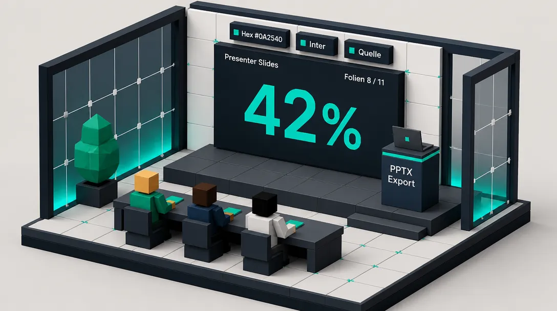
Schritt 4: Prompt formulieren, eckige Klammern ersetzen, Design-Block anhängen
Jeder Prompt enthält Platzhalter in eckigen Klammern, die mit konkreten Inhalten zu füllen sind. Drei Beispiele aus dem Pool:
Board-Briefing (Entscheidung herbeiführen):
Create an 8-slide Presenter Slides deck to brief senior leadership on
[TOPIC], based only on the uploaded sources.
Audience: [board / executive team], assume 2 minutes of attention per
slide and zero patience for filler.
Structure, one idea per slide:
1. Title slide: the decision or outcome at stake (not a generic topic
name)
2. Situation: where things stand now, in one line + one supporting
figure
3. Complication: what changed or what's at risk
4. Key insight: the single thing they must understand, stated boldly
5-6. Evidence: two slides, each one data point with brief
interpretation
7. Recommendation: the move you're advising, in plain language
8. The ask: exactly what you need from them and by when
Design: action-statement titles across the top; one hero number or
single chart per slide in the accent color; no more than 4 lines of
body text per slide; the Key Insight slide gets a full-bleed accent
panel. Speaker notes: one tight paragraph per slide. Ground every
number in the sources.
Investor-Pitch (Kapital einsammeln):
Create an 11-slide Presenter Slides investor pitch for [COMPANY],
based only on the uploaded sources.
Audience: [seed / Series A] investors. Tone: confident, specific, no
hype.
One claim per slide, in this order:
1. Company + one-line positioning
2. Problem (who hurts, how badly)
3. Solution (your approach in one sentence)
4. Why now (the shift that makes this the moment)
5. Market size (grounded in source figures)
6. Product (leave a clean placeholder frame for a screenshot)
7. Traction (the strongest real numbers from the sources)
8. Business model (how money is made)
9. Go-to-market (how you reach customers)
10. Team (why this team wins)
11. The ask (amount, use of funds, milestones)
Design: traction, market, and "the ask" slides each lead with ONE
giant hero number in big type and the accent color, with a one-line
label beneath, not a bullet list. Identical accent hex on every
slide. Use only figures present in the sources; where a metric is
missing, insert a clearly labeled placeholder rather than estimating.
Sales-Pitch (Interessent ins Boot holen):
Create a 9-slide Presenter Slides sales deck for [PRODUCT/SERVICE],
based only on the uploaded sources.
Audience: [prospect type / role]. Goal: move them from problem-aware
to ready to act.
Structure:
1. Their world: the problem as the customer experiences it
2. Cost of inaction: what staying the same actually costs
3. A better way: your solution in one sentence
4-5. How it works: two slides, the mechanism made concrete
6. Proof: results, case data, or testimonials from the sources
7. Options / pricing: clear tiers, no ambiguity
8. Objections: the top 2 concerns, answered directly
9. Next step: one specific, low-friction action
Design: problem slides lean on a single strong image concept; the
proof slide uses a logo or quote strip; the pricing slide uses 2-3
clean comparison cards with one "recommended" tier highlighted in the
accent color. Speak to outcomes, not features. Every proof point must
come from the sources.
Konferenz-Keynote (eine große Idee von der Bühne tragen):
Create a 10-slide Presenter Slides keynote built around ONE big idea:
[YOUR THESIS]. Use only the uploaded sources.
Audience: [conference / event]. This is a talk, not a document, the
slides support me, they don't replace me.
Slide flow:
1. A provocative opening line
2-3. The tension: why the old way is breaking
4. The turn: the reframe at the heart of the talk
5-7. The case: three vivid proof beats from the sources
8. What it means for the audience
9. A memorable one-line takeaway
10. Closing image + the idea restated
Design: most slides are a single bold statement centered on a near-
black background with one full-bleed image concept and almost no body
text, suggest the image for each slide. Build a narrative arc:
tension → turn → resolution. Put the full talk track in speaker
notes, written the way I'd actually say it out loud.
Webinar / Lead-Gen (lehren und weich konvertieren):
Create a 12-slide Presenter Slides webinar deck on [TOPIC], based
only on the uploaded sources.
Audience: [who's registering] who want [outcome]. Goal: teach
something genuinely useful, then make a soft offer.
Structure:
1. Title + the promise (what they'll be able to do after this)
2. Who this is for / the problem
3. The reframe (the shift in thinking that unlocks the rest)
4-8. The framework: name it, then one slide per step (3-5 steps),
each with a concrete example
9. A short case or before/after from the sources
10. Recap: the framework on one slide
11. [PLACEHOLDER OFFER SLIDE, leave a clean framed space and a
heading for me to drop my offer graphic in]
12. Final call to action + one next step
Design: framework slides use numbered step badges, simple line icons,
and soft accent panels; the recap shows the whole framework on one
slide. Keep it value-first; the teaching should stand on its own even
if no one buys. Ground all claims in the sources.
Onboarding / Training (selbstständig funktionieren):
Create a Detailed Deck (14-18 slides) to train [ROLE/TEAM] on
[PROCESS/TOPIC], based only on the uploaded sources. This must work
as a self-paced resource without a live instructor.
Structure:
1. Title + what you'll be able to do by the end (learning objectives)
2. Why this matters (context and stakes)
3. Overview: the whole process at a glance
4 onward, break into clear modules; within each module:
- The step or concept, explained in plain language
- A worked example
- A "common mistake to avoid" note
- A recap slide summarizing each module
- A short knowledge check (3-5 questions, answers on the next slide)
- A "where to get help / further resources" closer
Design: each module slide has a labeled header band, a simple diagram
of the step, and a boxed "common mistake" callout in a muted warning
tint; knowledge-check slides use a clean two-column Q/A layout. Use
speaker notes as instructor guidance and extra detail. Define jargon
the first time it appears. Every instruction must trace to the
sources.
Research-Readout (dichte Studie in lesbares Deck verwandeln):
Create a Detailed Deck (10-12 slides) presenting the findings from
the uploaded sources to [AUDIENCE].
Structure:
1. Title: the headline finding (not "Research Results")
2. Objective: the question this work set out to answer
3. Method: how the work was done, briefly (sample, sources, approach)
4-8. Key findings: one finding per slide, state it as a headline,
then the supporting evidence directly beneath
9. What it means: interpretation and implications
10. Recommendations: 3 concrete next moves
11. Limitations: what the data can't tell us
12. Sources / references
Design: each finding slide puts the headline (stated as the takeaway)
across the top third and a chart filling the lower two-thirds, with
chart type matched to the data (trend → line, comparison → bar, share
→ donut). Annotate the single proof number directly on each chart. No
3D, shadows, or heavy gridlines. Hold chart colors identical across
the whole deck. Do not overstate beyond what the sources support.
Strategie & Planung (Team auf Prioritäten ausrichten):
Create an 11-slide Presenter Slides strategy deck for [PERIOD, e.g.,
Q3 2026], based only on the uploaded sources.
Audience: [team / leadership]. Goal: align everyone on priorities and
how we'll measure success.
Structure:
1. Title + the one-sentence theme for the period
2. Where we are: current state, honestly
3. What we learned: 2-3 takeaways from last period
4. Priorities: the 3 things that matter most (and what we're NOT
doing)
5-7. One slide per priority: the goal, the approach, the owner
8. Roadmap: timeline of key milestones
9. Metrics: the targets we'll be judged on
10. Risks: top risks and our mitigation
11. Commitments: who owns what, by when
Design: the priorities slide uses 3 equal aligned columns; the
roadmap is a clean horizontal timeline with milestone markers; the
metrics slide is a row of large target numbers (small multiples, same
format repeated). Reserve the single accent color for the current
period's focus. Make priorities mutually exclusive and concrete; tie
every target to a source figure where one exists.
Concept Explainer (schwierige Idee zugänglich machen):
Create a 9-slide Presenter Slides explainer answering: "How does
[TOPIC] work?" for [AUDIENCE with little prior knowledge]. Use only
the uploaded sources.
Structure:
1. The question, stated plainly, as the title
2. What it is: a one-sentence definition, no jargon
3. Why it matters to this audience
4-6. How it works: break the mechanism into 3 clear steps, one per
slide
7. A real example that makes it concrete
8. Common misconception: what most people get wrong
9. The takeaway: the one thing to remember
Design: each how-it-works slide shows a left-to-right 3-step diagram
with labeled arrows, the current step emphasized in the accent color;
the misconception slide uses a struck-through "myth" beside a clean
"reality." Pair each concept with a simple supporting image. Assume
the audience is smart but new, define every term the first time. Keep
visuals explanatory, not decorative.
Decision / Comparison (Optionen gegeneinander abwägen):
Create a Detailed Deck (9-11 slides) to help [AUDIENCE] decide
between [OPTIONS], based only on the uploaded sources.
Structure:
1. Title: the decision to be made
2. Why this decision, why now
3. The criteria: what we're evaluating against (and how each is
weighted)
4. Comparison table: options as columns, criteria as rows
5-7. One slide per option: strengths, weaknesses, best-fit scenario
8. Tradeoffs: the honest "you can't have everything" slide
9. Recommendation: one clear pick, with the reasoning
10. Next steps: what happens if we proceed
11. Appendix: assumptions and source references
Design: the comparison slide is a true table with a filled/half/empty
circle in each cell, identical circle style across every row, no
decorative shading; the recommendation slide highlights the winning
column in the accent color. Only include criteria that actually
differentiate the options. The recommendation must follow logically
from the comparison.
Leave-Behind-Report (versendbares Dokument ohne Vortragende):
Create a Detailed Deck (12-16 slides) that fully stands on its own
when emailed, no presenter needed. Topic: [TOPIC], based only on the
uploaded sources.
Audience: [stakeholders] reading this asynchronously.
Structure:
1. Title + date + author
2. Executive summary: the whole story in 4-5 bullets
3. Context: background someone with no prior briefing would need
4 onward: the substance, in logical sections, each slide carries
enough text to be understood alone
- A "what we recommend" section near the end
- A "what we need / next steps" slide
- Appendix: detail, methodology, and source references
Design: a reading-deck layout, one bold key sentence at the top of
each slide, supporting text below in a comfortable serif, small
source footnotes at the bottom; the executive-summary slide uses a
boxed highlight panel. Write fuller slide text than a presenter deck
would, since no one narrates it. Keep it skimmable. Ground everything
in the sources.
Lightning 5-Minute (eine Sache, schnell, knappes Zeitfenster):
Create a 6-slide Presenter Slides deck I can present in 5 minutes
flat. Topic: [TOPIC], based only on the uploaded sources.
This is brutal economy, one idea per slide, nothing extra.
Structure:
1. The point: what I'm here to say, in one line
2. Why it matters: the stakes, one figure
3. The core idea or finding
4. The proof: a single strong data point or example
5. What I'm asking for / what to do
6. One-line takeaway they'll remember
Design: every slide is one oversized headline statement plus at most
one supporting line, high contrast, single accent color; no slide
gets a chart unless the chart IS the point. If a slide needs
explaining, it's too complex, cut it. Speaker notes hold a 30-second
talk track per slide.
Der entscheidende Punkt: Der Prompt selbst definiert die Inhaltsstruktur, der STYLE-Block die Markenidentität, die Design-Option-Ergänzung am Ende definiert die visuelle Stimmung. Drei Schichten, klar getrennt, einzeln austauschbar.
Schritt 5: Generieren, einzelne Folien nachbearbeiten, exportieren
Nach dem ersten Rendern lohnt sich der Blick auf zwei Details: Konsistenz und Lesbarkeit. Konsistenzprobleme entstehen, weil die Folien über mehrere Generierungen hinweg leicht variieren können. Blautöne weichen ab, Abstände driften. Die Lösung lautet, die Hex-Codes und Schriftnamen direkt in jeden Prompt zu schreiben und den Satz „Keep palette, typography, and layout identical across all slides” anzuhängen.
Lesbarkeit ist eine Funktion der Auflösung. Da Folien als Bilder gerendert werden, lässt sich Text im Nachhinein nicht mehr anpassen. Wer unsicher ist, generiert mit Default-Länge, prüft die Lesbarkeit, passt den Prompt an, generiert neu.
Die Nachbearbeitung pro Folie funktioniert über das Bleistift-Symbol am jeweiligen Slide. Der Revise-Modus erlaubt es, Text, Layout oder visuelle Elemente zu verändern, allerdings nur auf bestehenden Folien, nicht durch Hinzufügen oder Entfernen, und ohne erneutes Lesen der Quellen. Soll sich die Folienzahl ändern, ist eine Neugenerierung mit aktualisiertem Prompt erforderlich. Revisionen zählen gegen ein Kontingent, also mit Bedacht einsetzen.
Der Export erfolgt als PPTX (editierbarer Text, Titel, Speaker Notes) oder PDF. PPTX ist der empfohlene Weg, weil dort präzise Textkorrekturen, finale Marken-Politur und Animationen möglich sind, also alles, was im Notebook selbst nicht geht.
Umsetzungs-Checkliste: Was am nächsten Arbeitstag zuerst läuft
- Persona im Notebook setzen. Gear-Icon → Configure notebook → Persona-Text aus Schritt 1 einfügen → speichern. Eine Einstellung, die ab jetzt für alle Studio-Outputs gilt.
- STYLE-Block finalisieren. Marken-Hex-Codes, Schriften, Tonalität in einen wiederverwendbaren Textblock überführen. Falls vorhanden, Brand-Guide als Quelle ins Notebook laden.
- Eine Ästhetik auswählen und verriegeln. Einen der zehn Ästhetik-Blöcke aus Schritt 2 wählen, mit eigenen Markenwerten überschreiben, an einem Test-Prompt ausprobieren.
- Erstes echtes Deck bauen. Quelle wählen, Format und Länge festlegen, Prompt mit STYLE- und Design-Block kombinieren, generieren, einzelne Folien nachbearbeiten, als PPTX exportieren. Das kann ein interner Report sein, der schon länger auf der Liste steht.
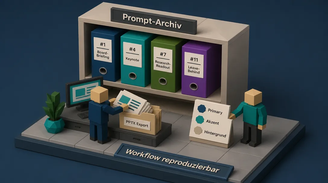
- Ergebnis archivieren. Prompt, STYLE-Block, Design-Block, generiertes Deck an einem Ort ablegen. Beim nächsten Anlass beginnt der Vorgang nicht bei null, sondern bei Schritt 3.
Stolperfallen: Sechs Fehler, die das Ergebnis verwässern
1. Quellen ohne Fokus. Ein Notebook mit zwölf lose verwandten Dokumenten produziert ein Deck, das nirgendwo richtig landet. Lieber weniger, dafür fokussierte Quellen. Wer thematisch breit arbeiten muss, erstellt zwei separate Notebooks.
2. Persona nicht gesetzt, STYLE-Block leer. Das Modell generiert dann mit Default-Werten, also mit dem, was alle anderen auch bekommen. Das Resultat sieht aus wie KI, nicht wie Marke.
3. Vage Adjektive statt präziser Werte. „Modern”, „edel”, „freundlich” werden vom Renderer ignoriert. „Inter, 24 px Headlines, Primary #0A2540” wird übernommen. Hex und Schriftname, nicht Stimmung.
4. Format und Länge verwechselt. Ein Detailed Deck mit Short-Länge wird zur Bleiwüste. Ein Presenter-Slides-Setup mit Long-Länge wird zur leeren Galerie. Beide Hebel bewusst setzen, nicht dem Modell überlassen.
5. Konsistenz dem Zufall überlassen. Ohne wiederholte Direktive im Prompt („Keep palette, typography, and layout identical across all slides”) driftet das Deck ab Folie 9. Konsistenz entsteht im Prompt, nicht im Nachhinein.
6. Revise mit der Erwartung, Folien ergänzen zu können. Das Revise-Werkzeug verändert Bestehendes, es fügt nichts hinzu und entfernt nichts. Wer die Folienzahl ändern will, muss mit angepasstem Prompt neu generieren. Wer das ignoriert, verbringt Stunden mit Klicks, die nichts bewirken.
Schnellreferenz: Prompt nach Anlass finden
Wer zwischen zwölf Prompts wählen muss, kann sich an zwei Leitfragen orientieren:
Werde ich im Raum sein, wenn das Deck gezeigt wird? Ja → Presenter Slides (#1, #2, #3, #4, #5, #8, #9, #12) Nein, es wird alleine gelesen → Detailed Deck (#6, #7, #10, #11)
Was ist der Job des Decks?
- Entscheidung herbeiführen → #1 Board Briefing
- Geld einsammeln → #2 Investor Pitch
- Kunden gewinnen → #3 Sales Pitch
- Raum bewegen → #4 Keynote
- Lehren und konvertieren → #5 Webinar
- Mitarbeitende einarbeiten → #6 Onboarding
- Studien teilen → #7 Research Readout
- Team ausrichten → #8 Strategie
- Konzept erklären → #9 Explainer
- Optionen abwägen → #10 Decision Deck
- Versendbares Update → #11 Leave-Behind
- Eine Sache schnell → #12 Lightning
FAQ: Häufige Fragen zu NotebookLM Slide Decks
Wie funktioniert die Folien-Erstellung in NotebookLM konkret? Quellen werden in ein Notizbuch geladen, im Studio-Bereich wird das Slide-Deck-Feature geöffnet, Format (Detailed Deck oder Presenter Slides) und Länge werden gesetzt, ein Prompt wird eingefügt, die Generierung läuft. Anschließend lassen sich einzelne Folien über das Bleistift-Symbol nachbearbeiten und das Deck als PPTX oder PDF exportieren. Das gesamte Feature ist Teil der Studio-Werkzeuge von NotebookLM, dokumentiert in der offiziellen NotebookLM-Hilfe.
Welche Formate und Längen gibt es beim NotebookLM-Präsentationsmodus? Zwei Formate: Detailed Deck liest sich eigenständig und eignet sich zum Versenden, Presenter Slides sind textarm und auf gesprochenen Vortrag ausgelegt. Drei Längen: Short, Default, Long. Zusätzlich kann eine exakte Folienzahl direkt im Prompt genannt werden, was bei strikten Zeitfenstern sinnvoll ist.
Wie lassen sich NotebookLM-Folien als PPTX exportieren? Seit Februar 2026 unterstützt NotebookLM den Export in PPTX (Google Workspace Updates, Februar 2026). Die exportierte Datei enthält editierbaren Text, Titel und Speaker Notes, sodass sich letzte Korrekturen und Brand-Feinschliff in PowerPoint oder Google Slides erledigen lassen. PDF steht weiterhin als Format für statische, finale Decks zur Verfügung.
Wie bleibt die Markenidentität über mehrere Decks hinweg konsistent? Über zwei persistente Elemente: die Persona auf Notebook-Ebene (Gear-Icon → Configure notebook) und einen wiederverwendbaren STYLE-Block mit Hex-Codes, Schriften und Tonalität, der vor jeder Generierung an den Prompt angehängt wird. Zusätzlich hilft es, den Marken-Guide als Quelle ins Notebook zu laden und im Prompt explizit auf ihn zu verweisen. Das Modell liest die Datei wie jede andere Quelle und übernimmt die Werte konsistent.
Warum wirken die Folien manchmal inkonsistent, obwohl ich denselben Style verwende? Weil Folien als Bilder gerendert werden und über mehrere Generierungen leichte Varianzen entstehen können. Abhilfe: Hex-Codes und Schriftnamen explizit im Prompt benennen, den Satz „Keep palette, typography, and layout identical across all slides” anhängen und nach der Generierung die Konsistenz prüfen. Einzelne abdriftende Folien lassen sich über das Revise-Werkzeug gezielt nachjustieren.
Welche Prompt-Strategie liefert die besten Ergebnisse für quellenbasierte Folien? Die Inhaltsstruktur im Prompt, der STYLE-Block mit Markenwerten und der Design-Block mit visueller Stimmung als drei klar getrennte Schichten behandeln. Davor eine Persona mit Designprinzipien setzen, danach konsequent in eigenen Marken-Hex und Schriften verriegeln. Wer diese Architektur einmal aufgesetzt hat, kann denselben Inhalt in beliebigen Stimmungen rendern, ohne den Prompt neu zu denken.
Ein persönlicher Abschluss
Was an diesem Workflow bleibt, ist weniger das Tool als die Disziplin. Ein Prompt kann noch so gut formuliert sein, wenn die Persona auf Standard steht, der STYLE-Block leer bleibt und die Quellen im Notebook beliebig sind, sieht das Ergebnis aus wie alle anderen. Umgekehrt verändert sich die Qualität sprunghaft, sobald diese drei Stützen einmal sauber stehen. Der Rest ist Übung.
Die zwölf Prompts sind keine fertigen Lösungen, sondern Bausteine. Wer das System einmal verstanden hat, kombiniert sie nach Bedarf, ersetzt Ästhetik-Blöcke, passt Format und Länge an, generiert, korrigiert, exportiert. Genau darin liegt der Wert: nicht in einem magischen Prompt, sondern in einem reproduzierbaren Verfahren, das mit dem eigenen Inhalt, der eigenen Marke und dem eigenen Anlass wächst.